
Bonjour! And greetings from Montréal, where I’ll probably be when this goes out.
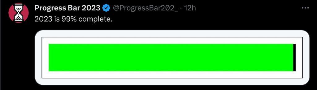
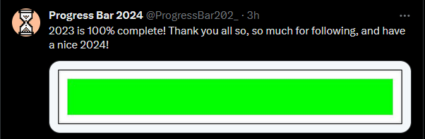
And, hey! Would you look at that? The end of 2024 is nigh! At least, according to this progress bar on the site forever to be known in my heart as Twitter.
I suppose that means there’s not much time left for me to do… anything, really. But, before the next year begins, there’s one more design-adjacent topic that’s been burning a hole in my brain, and I need to write about it.
What the hell happened to the progress bars?
Well… nothing. Nothing in the grand scheme of things, anyway. Except in a place that bothers me, specifically.
Part 1: Me and the Screens
As I’ve said, I work in I.T. I’m basically developing a game out of spite about it.
As part of that job, I spend a lot of time looking at loading screens. Actually, I do that for game development, too. Loading screens just rule my life, in general.
As you might imagine, lots of loading screens means a lot of waiting. And if there’s one thing I’ve learned, from my many, many years of waiting on computers, it’s this:
Loading bars are my friends.
It’s a bit of a weird statement, I know – mainly because of the implication that a UI element is capable of friendship. But also because – as my boss recently reminded me – most of the progress bars I’ve dealt with in my career have been liars.
For example: Windows 7.
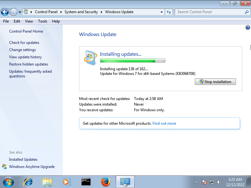
Windows Update, back in the Windows 7 days, had a pretty simple display. There was some text, some buttons, and a little loading bar… thingy.
Now, this progress bar was – and forever will be – a liar. The fact that the bar was ~90% full meant nothing, if whatever that last 10% was took ages to install.
I admit that, at the time, I grew to resent it a bit. After all, when you’re updating 30+ computers at once, there’s only so long you can be stuck at 99% before your sanity begins to abandon you. And I updated a lot more than that.
However, in recent years, I’ve come to look back more fondly on my time with this interface. I didn’t realize how good I had it.
Part 2: This is a Windows Call-Out Post
Y’know what’s worse than a loading bar that lies to you?
This.
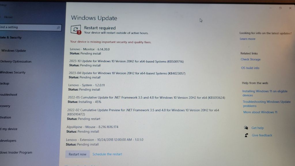
With the advent of Windows 10, Microsoft replaced the old update window with this extremely scuffed wall of text. When they originally did this, I didn’t hate it. Actually, being able to see the progress on all the individual updates was, in theory, nice.
However, I soon realized that this interface is, in fact, garbage.
Here’s why.
Exhibit A: Readability
Now, if you haven’t studied that image of Windows 10 yet, try playing a little game with me, here. For just a brief moment – for less than half a second – take a quick glance at it, then immediately scroll back down here.
Go on. I’ll wait.
…
Cool.
So, now that you’ve glanced at that ever-so-briefly, tell me – how close to done is that computer?
The answer, by the way, is not very.
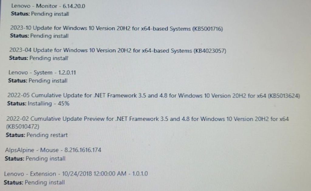
Of those shown here, most of these updates haven’t started installing yet – as far as windows says, at least. They’re “Pending Install” – i.e. waiting on that one update that’s currently installed. Some are waiting on a restart, while updates that have already been completed, but don’t require a restart, have probably been removed from the list.
This is – to put it simply – annoying.
Is it impossible to work with? No – but the wall of text approach adds a level of friction that wasn’t there in some older versions of windows. Walking around, monitoring the progress on a bunch of different computers now involves the extra step of reading the text, and making sure that each one is actually done before moving on.
Of course, that doesn’t really matter, right? At the end of the day, I’m still waiting just waiting for every item in the list to be done, right?
Well…
Exhibit B: The Button.
As I said, these updates aren’t really close to done. So, that said… what the hell is that?
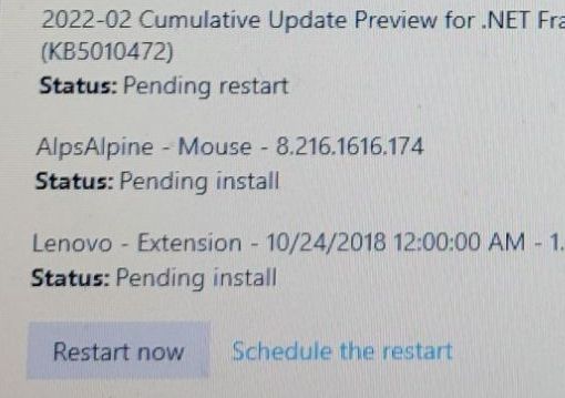
This is a manual restart button, there so you can restart your computer to finish updates. This button is not always here – but appears when an update is waiting for a restart.
Any update.
In this case, 1 out of 8.
…
With the things I just said about the wall of text, maybe you’re beginning to see an issue here. The most attention-grabbing part of the update screen, as shown here, is a button that interrupts everything to complete one of the many updates in progress.
This is a choice that I find to be… interesting. Interesting in the sense that I have, on several occasions, misread “Pending Install” for “Pending Restart”, and spent several shameful minutes waiting for the computer I was working on to come back up.
In one of my early group projects in college, I was working down to the wire. It was 1am, the night before a due date, and we had a concede functionality that wasn’t fully implemented yet. I had only the most basic grasp on Unity’s UI, and even less of a handle on programming, so when I was trying to slip an implementation in at the last minute, what I did was this:

Whenever I look down at the Windows 10 update screen, all I see are the echoes of my own design atrocity, gazing back at me from the abyss. Why is it here? Why not wait for updates to be… done? There’s already a restart button in the start menu, with little notifications for updates and all!
Why put a big “INTERRUPT PROGRESS” button there? Does restarting before others are done make it faster? Are you supposed to do it that way? If you are, why doesn’t it say so anywhere???
In my extremely inconsequential and uninformed opinion, this is not a good button. But, at the very least, in Windows 10, you have a better idea of how things are progressing, even if the presentation is lacking.
…
Exhibit C: No, Windows 10 is also a massive liar, actually
I mean… yeah. The fact that you have a list of each update in front of you now doesn’t mean each update has the same size, nor same download/install speed. And, for that matter, the little percent displays for each update are subject to the same issues as Windows 7’s progress bar; the last 10% can still eat up 90% of your time. It’s not a 1-to-1 display.
As a fun bonus for me, there’s a wide range of ages on some of the school computers I work with, meaning that a fair number of them are bad at taking updates – especially for Windows 10 and 11. They fail frequently, and now, instead of having a little bar that stops animating, they just… sit there.
Waiting.
Silently.
As I leave them to finish some updates overnight.
Only to find the next morning that the window had frozen a few minutes in.
Ugh.
Part 3: The Point (Yes, there is one.)
I’ve held these opinions about Windows Update for a while, but never really had anything worth writing about. I actually don’t like writing purely as a form of venting, personally – and I want to be clear that most of the stuff you just read is a bit tongue-in-cheek. This isn’t blog post isn’t important. None of this stuff is.
Then, in the whirlwind work days leading up to Christmas, I was working on some old computers – the kind of old where they’ll probably be on their way to a recycling center in a few months, anyway – just to see if there was any life in them. They were having some trouble with updates on our tests of Windows 10 & 11, so I was running the Windows Update Assistant on them, and I saw this:

That’s a pretty simple UI. However, sitting there, ticking down the minutes until the holidays began, a thought popped into my head:
“…This feels better to look at than the usual updates screen. Why?“
It’s not like these crusty old laptops were any faster than the others. Far from it. Nor was the UI that different in principle – it’s just a percent. Yet, I definitely found the process of watching them plod along to be a bit better than normal.
After letting the ideas stew in my head for a while, I think that what I’ve experienced here is a nice little anecdote for the way presentation affects how we perceive information.
It’s a instinct, I think, for our brains to try and read a loading screen the same way we’d read a clock, or an hourglass – a display of how long something is going to take for us. To have that frustrating feeling, watching an update stall out right near the end, with a “Come on! It’s right there! Hurry up!”
But… that’s not really what a loading screen is, is it? None of these Windows displays I talked about are accurate depictions of how much time my work is going to take – they’re the computer’s concept of it’s own progress. The average user has got no way of knowing the variables affecting these things.
The loading screen is there as a convenience – a visual for you to look at while you wait, and to answer the question at hand:
“Is this thing done yet or not???”
I think that many of my issues with Windows 10’s UI here have a lot to do with that. It presents more detailed information, sure – but it also obfuscates. It presents a wall of information for the user to process (out of order, I might add!) which doesn’t really communicate the time it’s going to take any better! It just gives you more to read – and the ability to screw it up!
Was Windows 7’s loading bar simple? Yeah! Was it a liar? Sure! But really, it showed what you needed to know:
“Is it working?”
-and-
“Is it done?”
-and then gave me a blinking green light to stare at, to boot.
I’m a simple man! That’s all I really need!
Part 4: The End
Before I go, and post this, I might as well check what time it-
Oh.
Well, unfortunately, the 2023 progress bar is a good measure of time, as perceived by humans. The part of my brain in charge of writing, ironically, is not.
I cut this one a bit closer than I was expecting. Really saved by the existence of time zones tonight.
2023 was a… rollercoaster of a year, for me. It had some high highs and some low lows. Looking back, one of the things I’m surprisingly most proud of is what I’ve done here. I’ve never been great at public-facing stuff in the past, but this blog kind of crept up on me. It went from a way of proving to potential employers that I’m still alive every few weeks to something I actually enjoy doing, and experimenting with. And that’s… nice.
…
Well, it is 11:30pm, and I’m on vacation, so I’m running out of words now.
Have a good 2024, everyone!

Leave a comment